First, let's get something out of the way. Most of what's really new in Windows 8 relates to the Metro touch interface, which is Microsoft's biggest bet on this OS generation – a bet that's risky but necessary given the company's lack of presence in the growing tablet market. This is also how the folks at Redmond have figured could give a needed boost to its smartphone business ("Windows everywhere"), which is well behind market leaders, iOS and Android.
This review is based on my experience with Windows 8 using a desktop, so I've been treating Windows 8 like most computer enthusiasts will: as a direct upgrade from Windows 7 on my custom-built machine, just like I did with Vista, XP, 2k, and other previous Windows releases.
As you've heard repeatedly in the past year, the new Windows Start screen replaces the Start menu, and that's a radical shift for the platform. A few months ago, we wrote an editorial about using the Start screen as a Start menu replacement. Feedback was overwhelming and evidently divided. I don't feel the Start screen is perfect on a desktop, nor is it a fully competent replacement, but once you settle on the idea and spend time configuring the screen to your liking, it's a viable solution for quickly accessing programs.
The Start Screen
Performing basic tasks on the Start screen can be easily done using a mouse. Scrolling horizontally feels natural, though certain operations, such as removing a program from the Start screen, aren't intuitive enough and show the UI's tendency to favor touch. In this case, you have to right-click a tile and select an option from a menu that pops at the bottom of the screen. On a mouse-oriented interface, you would get a contextual menu where you clicked.
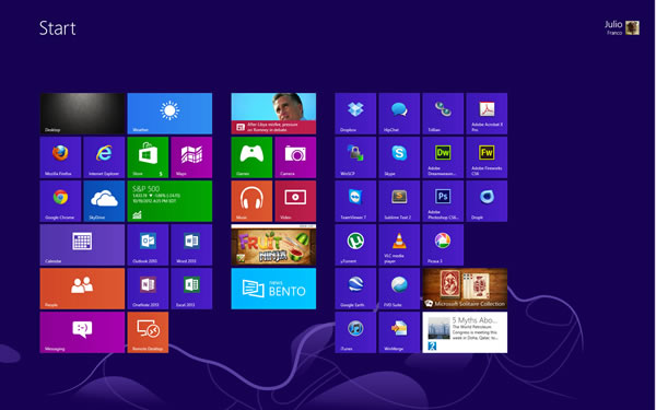
Software installed from the Windows Store is added to Start in a few clicks, showing how these new and often simpler apps have been optimized for Metro. Conversely, traditional desktop programs get ugly shortcut tiles, and some applications that are unaware of Windows 8 can add many unnecessary tiles to the Start screen, like uninstallation or program help shortcuts. This issue is replicated when you use the "All programs" menu. Until third-party software is updated, what you get is an alphabetical list of all possible shortcuts from software installed on your PC, not just programs.
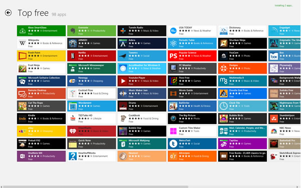
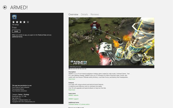
On the upside, for less demanding users who want to discover what the new OS and interface has to offer, Windows 8 enjoys of a healthy list of free software you can easily install from the Windows Store. Think about the first time you used an iPhone or Android smartphone and downloaded something from their respective app stores. A few taps later and you can successfully download a handful of programs to try. It's the same here, and that's a first for Windows.
User Accounts, Getting Social and the Cloud
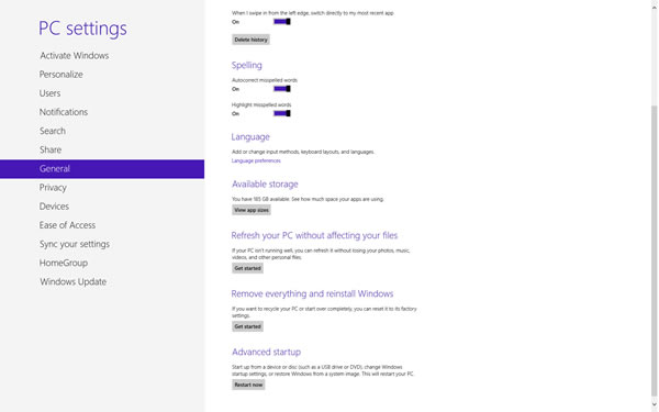
Upon installation, Windows 8 prompts you to set a user account for the first time. As usual, you can get started with a local account and password, but now you also have the option to login with your Microsoft account (Hotmail, Xbox, etc.). One of the advantages of choosing the latter is that you can sync settings across Windows 8 devices, your lock screen, wallpaper, Internet Explorer open tabs and history, color scheme, among a few others, but not your tiles, which would have been ideal.
Using your Microsoft account to sign in will also get the Mail, Contacts and People apps filled with the appropriate information, which may be useful for some. If you have a Skydrive account, photos can be seamlessly backed up to the cloud, which is one of the ways Windows 8 leverages the cloud and makes Skydrive omnipresent. The People app can also work with other social platforms like Facebook, Twitter, Google and LinkedIn. The Calendar can add your Google Calendar data, too, and across these applications, it feels like Microsoft has done a great job to integrate popular services, even when each of the apps' options remain spartan.
Metro Apps
I spent little time using Metro-style apps because they are a bit gimmicky on the desktop.
For example, the built in weather, news and stocks tiles can show usable and interesting information at a glance, but I rarely stop to see what's in there while I'm working. The Mail app is nicely styled, but in terms of usability, the fonts are too big and on the desktop you don't really need a mail application to take over your whole screen, especially not on a big monitor. A beginner who needs simple mail access might find this convenient, but any standard email program works better on the desktop.
This last scenario plays out a lot with most of the "modern" Metro-styled apps. You get a bold interface that turns your PC into an appliance, and that can be a good thing if you want to perform one specific task at a time. But if you want your PC to serve as a PC, you'll be going back to the desktop. And if you're going to live on the desktop, we must address the absence of the Start button.
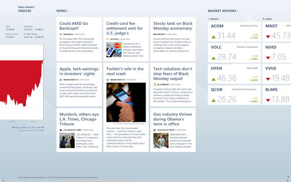
Note the difference between Start button and the Start menu. The former could have remained part of Windows, even if it was added as a shortcut to the Start screen. You might recall a video from the first Windows 8 public preview where an average dad couldn't get around Windows without a Start menu for navigation. There's also a joke about how you can't turn off a Windows 8 PC (it's hidden on the Charms bar, and it takes a few clicks to get there).
I've been using Windows 8 for a few months (counting the betas) and I sometimes feel the same way. Stardock and Pokki offer a Start menu add-on that work well, but that's beyond the point. For such a customizable operating system – heck, it even has two Settings menus, one in Metro and the usual Control Panel – it's missing the option to add a Start button if you don't like the lower left hot corner to access Start.
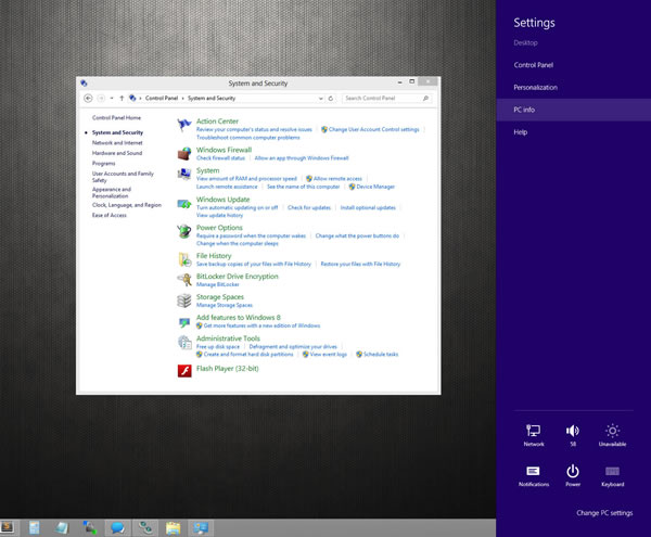
Hot corners work kind of ok if you are on a single screen. I imagine they also work well on touch screens, but they are clumsy to use when you are using two monitors or more. The Charms bar would have no room to exist if Windows remained a desktop operating system, but in slate mode, it works as a contextual menu for settings, searching within an app and for going back to Start.
You may recall how Windows 7 dropped most annoying balloon notifications by condensing them to a single configurable icon on the taskbar. Windows 8 notifications use a different approach because they are Metro-based, meaning they're a bit bolder and match your color theme. I'm not particularly keen of them, so it's great there's still a way to manage them, but I feel I should mention this because it's the type of dialog that can pop up and somewhat disrupt the visual environment you're in. There are a few other instances when you will get "Metro" prompts on the desktop, such as when you try to open a file without a program association. It's as if the developers wanted to force a merger of both sides of the OS, but the end result doesn't feel as natural or as polished as it could have been.
